The Benefits of Proper Typography in UX Design
Use typography with intention and purpose
Originally posted at https://www.nektic.co/post/the-benefits-of-proper-typography-in-ux-design

Understanding the importance of typography to your design.
An essential aspect of UX Design is considering the readability, hierarchy, and accessibility when creating a website or application. Executing proper typography practices and techniques can improve user experience, making it easier for users to understand and navigate the interface’s contents, leading to better engagement, conversion, and increased user retention.
How we present text on the interface can greatly impact how easily and effectively users can understand and navigate the content. Poor typography can make it difficult for users to read and understand the information, resulting in poor user experience and may decrease user retention.
Classifications
Understanding the subtle differences between typefaces

Different classifications, different emotions, different roles. Applying typography to your design needs one to understand its purpose. Here are some common classifications that I, personally used often in my design (especially the top 3).
- Serif
Serif fonts are typefaces composed of small lines or details at the end of the strokes within letterforms. They are simple and traditional in appearance and often used for body text and/or headlines as they lend a bit of formality and elegance. Serif evokes emotions such as integrity, classic, and honesty.
Some common examples of Serif are Frank Ruhl Libre, Times New Roman, Playfair Display, and Lora. You may also browse more Serif fonts here https://fonts.google.com/?category=Serif. - Sans Serif
Sans serif fonts are typefaces without serifs. They are generally considered more modern, clean, and minimal than serif fonts, making them commonly used for digital and/or web applications.
Sans serif fonts are used for titles, headlines, or other display text, as well as for body text. They are also often used for branding and logo designs, particularly in modern or minimalistic designs. A widely used free sans serif font is Inter. - Mono (Monospace)
I personally use monospace when displaying code snippets. These types of fonts are ideal when you are looking for a techie design direction. Monospace is also often used for terminal applications, text editors, and typewriter-style text. One of my favorite mono typefaces is Roboto Mono. - Slab
Slab typefaces are somewhat related to Serif fonts. One common characteristic of Slab fonts is their bold and thick font weight, which is ideal for logos and branding materials. They evoke emotions of wanting to stand out or when one wants to make a statement.
It is also recommended for headlines and other large-scale designs. An example font for this is Roboto Slab which is my go-to slab font. - Display
Display font type is used for large blocks of text, headlines, logos, posters, and other forms of visual communication. Its purpose is to draw the eye and engage the reader.
It is designed to be attention-grabbing and memorable and often has a more stylized, decorative appearance than its counterparts. Its larger sizes and bolder lines make it easier to read and stand out.
There are a lot of other classifications of typefaces that I haven’t mentioned. For example, handwritten (or calligraphy) typefaces are commonly used for love letters as they invoke sensuality, empathy, and soothing emotions.
Another one is decorative which is mostly used for graphical designs like posters for Halloween, Christmas, or any other global celebrations.
Improving user retention through typography
Readability
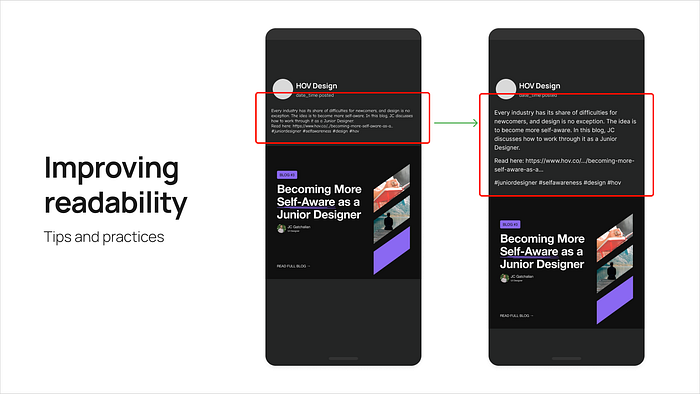
Enhancing screen readability for User Retention and Accessibility. Ensure text is well-structured, with appropriate line height, margins, and font size for easy reading.
Considerations
- Clear and legible typefaces
- Appropriate line height and kerning
- Variants availability
Key metrics
- User retention
- Accessibility
Responsiveness
The adaptability of your texts on different screen dimensions. Ensure typography adapts to different screen sizes and devices to provide a seamless experience across devices.

Considerations
- Sizes of your texts on different screen sizes
- Typographic breakpoints
- Naming your font size in CSS (Design token)
Key metrics
- Adaptability
- Accessibility
- User satisfaction
Contrast & Hierarchy
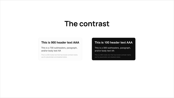
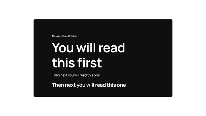
Use font size, weight, and color to create a visual hierarchy and guide users’ attention. Contrast refers to the difference between the light and dark elements of a design while Hierarchy is the arrangement of elements in order of importance.
Considerations
- Colors of the text against the surface background
- Visual hierarchy
- Scannability
Key metrics
- User retention
- Heat maps (visualize where users are clicking on a page)
- User Satisfaction
Consistency
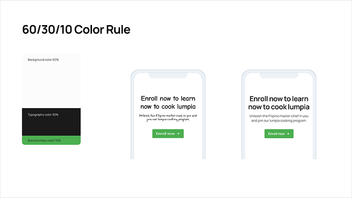
Maintain a consistent typographical style throughout the website and app. Involves using the same typographic elements throughout a design, such as the same font, font size, line spacing, and color to create a strong visual identity.
Considerations
- Color application to types
- Size option limitations and constraints
Key metrics
- Brand awareness
- Establish brand identity
Applying arithmetic to typography
I rely so much on arithmetic as my base guidelines for my typography line height, weight, kerning (letter spacing), and paragraph spacing. Using simple arithmetic calculations allows me to have faster decision-making and helps my design to be consistent.
Here are some simple tips I can share on how to use math for your typography scaling.
Titles, Headers, and Subheads are typically one of the largest scales in an interface. For line height, use 1.2 as your multiplier (for some it can be 1.3 considering different fonts have different characteristics as well).
Headers have typically tighter line height scales compared to the paragraph. For kerning, my go-to range is -1.0%, -1.5%, up to -2.5%.
fontSize * 1.2 = lineHeight; Round to the nearest 4pt
Paragraphs are typically multi-line so you want more breathability added to them. The smaller the paragraph size is, the higher the kerning and line-height values. Use 1.5 as your line-height multiplier. For kerning, my go-to range is 0% to 1.5%.
fontSize * 1.5 = lineHeight; Round to the nearest 4pt
Button labels and captions are mostly one-liners and occasionally two-lines. So getting the baseline is optimal which means the recommended multiplier is 100% or 1. For kerning, my go-to range is 0% to 1.5%.
fontSize * 1 = lineHeight; Round to the nearest 4px
Note: I use those simple math computations to give me a head start (base) when adding spacing values. You may make adjustments according to your needs without worrying about breaking the given rules.
Design with Emotion in Typography
Typography can make or break your design. So it is definitely important to define the purpose of your typefaces and what role they are playing.

Example of the statement with different typeface applied to it.
Using Sans Serif

How about we apply a Handwritten typeface?

Now let’s see if you use something Decorative.
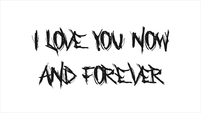
How do you feel seeing the last version? You make the judgment.
You may also check my slide presentation version of this written blog @ The Impact of Typography on User Experience
Thanks for reading!
— Estella, Designer and Tech Community Leader
